2017 | Case study
Sundance.org design system and CSS refactor
Role: UI Design, Front-End Development, Strategy, Implementation
This project involved a complete overhaul of Sketch documents, a CSS refactor, and the creation of a formal design system for Sundance.org.
I. Sketch Overhaul (Design Debt)
Sketch 41 introduced nested symbol overrides, making it one of the single greatest Sketch updates to date. Designers could now create an entire microcosm of symbols by nesting symbols inside of symbols inside of more symbols. After Sketch 41 was released I soon realized that I was going to have to revamp all my Sketch files. Thankfully there are brilliant people in this world who are always paving the way.
Jon Moore and Lloyd Humphries, do a fantastic job of highlighting how best to approach utilizing deeply nested symbols in building components within Sketch.
Jon Moore's UX Power Tools became my starting point, which comes preloaded with an entire ecosystem of symbols and components. I spent several days tinkering and learning, learning and tinkering until finally, I had put together a library of components that was fit for Sundance.org.
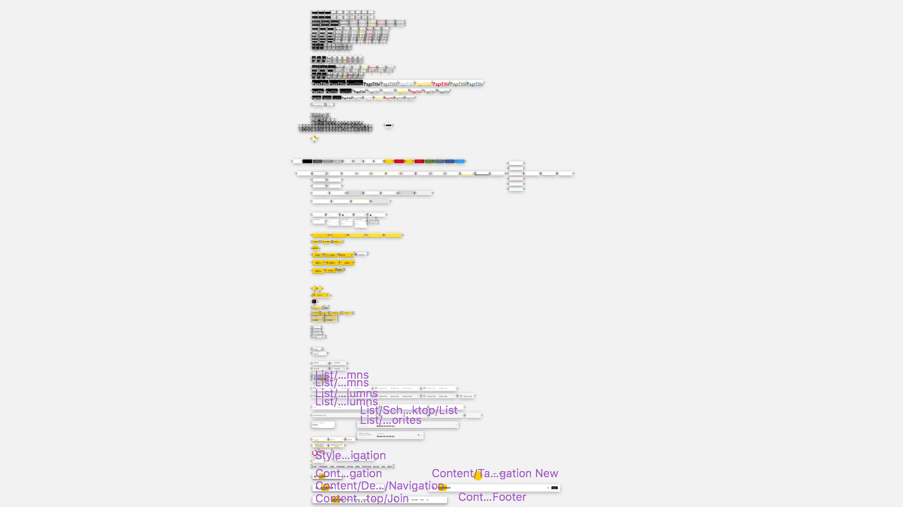
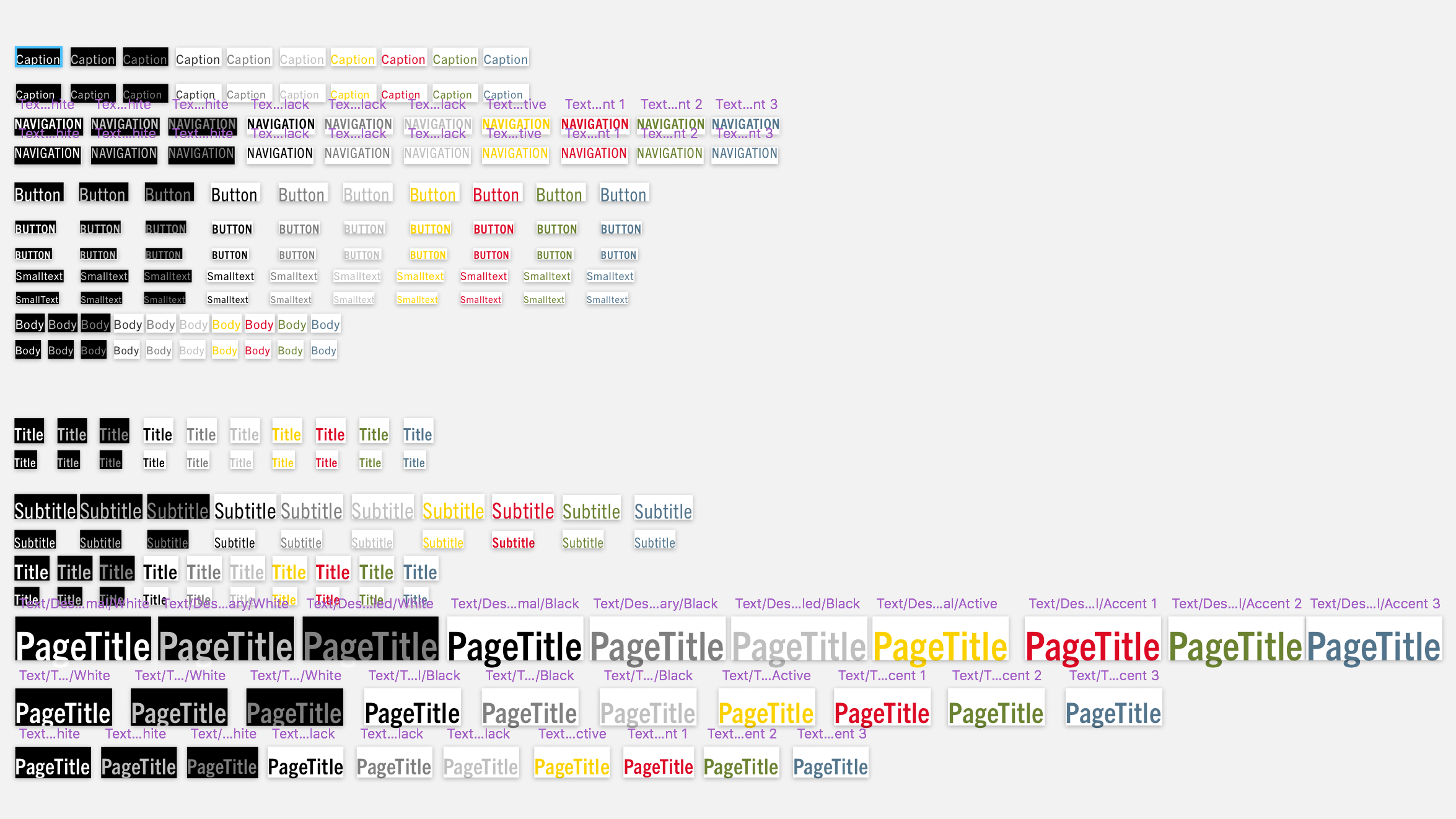
Here is a sample of my symbols page. It looks and is pretty hairy, but the madness is worth it when you get every symbol working properly.


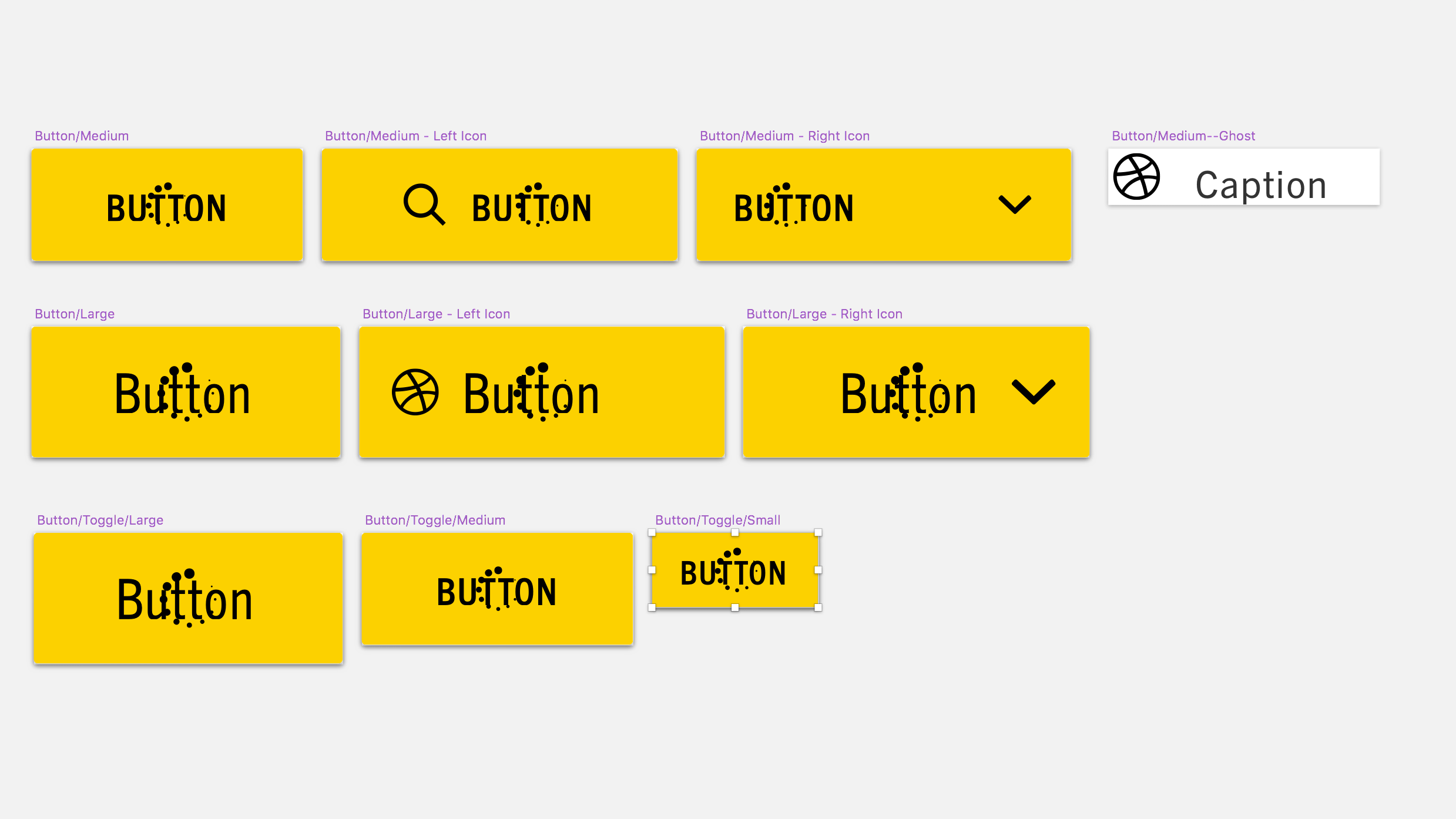
Nearly every design component used on any given screen was constructed using symbols with content overrides. This meant that near-perfect consistency would be maintained across the entire document.
Going through this process also forced me to address a lot of other issues that were present in my initial designs. For example, Sundance.org lacked a true baseline grid, which gave the site a perceptibly poor vertical rhythm. I took advantage of this opportunity to spent almost an entire day recalculating every space and line-height throughout the entire site. It's astonishing how subtle that change was and how much of an impact it had on every single page. With these tweaks out of the way, our team would now need to strategize on how to go about implementing a complete refactoring of the site's CSS.
II. Refactoring with ITCSS/BEM
Without proper rules and strategy, CSS is a language that lends itself to misuse. Often times developers will write styles specific to one component without thinking critically about how that code could be reused across other elements. This is what happened in 2014 when our team rebuilt and relaunched Sundance.org. I had been the sole author of all the CSS during the 2014 relaunch project and had made a lot of poor decisions.
After lots of research and deliberation about how we wanted to approach architecting our CSS, we decided to use a methodology called ITCSS. ITCSS is based on the idea of organizing CSS in an inverted triangle starting from most broad and far-reaching styles at the top of the hierarchy and building downward to increasingly specific elements.
Here’s a quick breakdown:
1. Settings (preprocessor variables, font sizes, colors, configs)
2. Tools (preprocessor mixins and functions)
3. Generic (normalize, reset, box-sizing)
4. Elements (HTML DOM elements, no classes)
5. Objects (non-cosmetic design patterns like wrappers, alignment, cropping)
6. Components (cosmetic/branded design patterns)
7. Overrides (otherwise known as the shame folder)
Harry Roberts, the creator, provides a fantastic, in-depth explanation of how ITCSS works.
We had initially wanted to avoid the use of frameworks since they often bring with them tons of unwanted styles that you have to untangle. Thankfully Harry Roberts created InuitCSS. InuitCSS is a framework comprised of both ITCSS methodology and BEM naming conventions. A framework in its purest sense, InuitCSS comes only with the basic architecture of a CSS library. It contains nothing in the way of aesthetic. Furthermore, InuitCSS brings so much utility out of the box that you can assemble entire patterns without having to write very many custom class styles.
With our Sketch components completely laid out and a new CSS methodology, the only thing left was the hardest part... execution.
III. Abstract Refactoring
Making sweeping changes to a website's codebase is full of risks. Coordinating work between teams and team members becomes very tricky when you have to deal with the fact that projects are constantly in motion. We wanted to do everything we could to avoid this nightmare so I opted to build each of the patterns in abstraction, outside the codebase and out of pace with the other projects that were progressing. Using Jekyll with InuitCSS installed, I built every component to spec before moving the new CSS into the actual codebase. The migration process only took several weeks, which minimized the amount of time that we spent living between two vastly different CSS libraries.
One unintended consequence of executing the refactor in abstraction on a Jekyll instance was that we could now publish it to Github pages as a living style guide. This has become an invaluable resource for our dev team and for external vendors to reference.
The Results
Pre-refactor CSS:1025kb at 27,477 lines
Post-refactor CSS: 300kb at 8,000 lines
Estimated Final CSS File: ~175kb (after minification)
Pre-refactor largest selector length: 11
Post-refactor largest selector length: 7
Pre-refactor total selectors used: 4674
Post-refactor total selectors used: 939

